Wednesday, 6 May 2015
Monday, 20 April 2015
Double page spread final

This is my Double page spread that I created on 'adobe in design'. When undergoing my double page spread I had difficulty using the software. Firstly I created a B in the background, to represent Ballad as it is my music cover masthead. I then created text showing the exclusive interview with Priya Kailey.
I started adding in quotes from the interview, one for example 'it's not about the money it's about the people'. I also placed a picture of the star (on the right) so it looks like she is reading it herself, as well as showing the realism and authenticity of how she is in her day to day life.
I wasn't too happy with the quality of the picture as it doesn't look as clear. I chose a simple colour pallet because I didn't want it to be complicated, as you can see mainly red and black.
Contents page final


Sunday, 12 April 2015
Front cover comments

As you can see, I got teachers comments showing me how to improve on my work. Examples such as: drop shadows, smaller bar code etc. I took all of these comments into account, as I made changes to my cover.'Exclusive interview with Priya Kailey' got criticized because of the way it was positioned diagonally, as well as it not being the main feature.

From looking at my comments I made all of the adjustments, apart from the drop shadow as I thought it looked tacky and unprofessional. The only problem I had was making the text look clear, as the artists' hand blended with the text. I also kept the 'Exclusive interview with Priya Kailey' diagonal as I thought it flowed with the position of the guitar. I also changed the size of the price, as I didn't want it to look more important to the captions.
Front cover final

This is my front cover, I designed this in 'adobe photoshop' I'm quite happy with what I've produced. Firstly I took a photo with the thought in mind of classical, as it was the most popular from the results from my questionnaire. After I got my photo, I started experimenting with fonts and colours for my masthead. Then I changed the effect on the picture making it more crisp and sharp. I then started adding in my captions (seen on the left) as well as choosing a simple colour pallet as I wanted to make unique and smart. 'Exclusive interview with Priya Kailey' is in a playful font, as it looks like she has signed it herself, it is also diagonal following the way the guitar is facing.
Thursday, 5 March 2015
music magazine questionnaire

This is my questionnaire for my music magazine to get a general outcome of what the public wants to see on my front cover.
Out of 30 people I asked liked the fact of orange, blue and a white colour scheme and the fact of having more images on the front cover, as well as the main genre being classical. I felt using these questions would aid me into getting the best out of my magazine. By asking questions like 'how old are you' let me gain knowledge of what different ages like so I could appeal to most of them.
Wednesday, 4 March 2015
Draft pictures


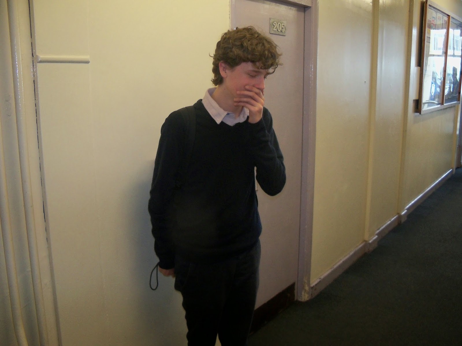


These are some pictures that I took for the front of my cover however they were not up to standard, or suitable for a front cover. I didn't like the positioning as they seemed to be unprofessional. As you can see they are smiling or not looking at the camera, as well as the background being dull and too plain. Another reason why I didn't like these photos, was their attire as they didn't flow with one another and looked scruffy.
Subscribe to:
Comments (Atom)